Hi Traders! GBPCHF forecast follow up and update is here. On December 8th I shared this “Technical Analysis – GBPCHF Forecast” post in my blog. In this post, let’s do a recap of this setup and see how it has developed now. If you would like to learn more about the way we trade and the technical analysis we use then check out the Traders Academy Club. Spoiler alert – free memberships are available!
My Idea
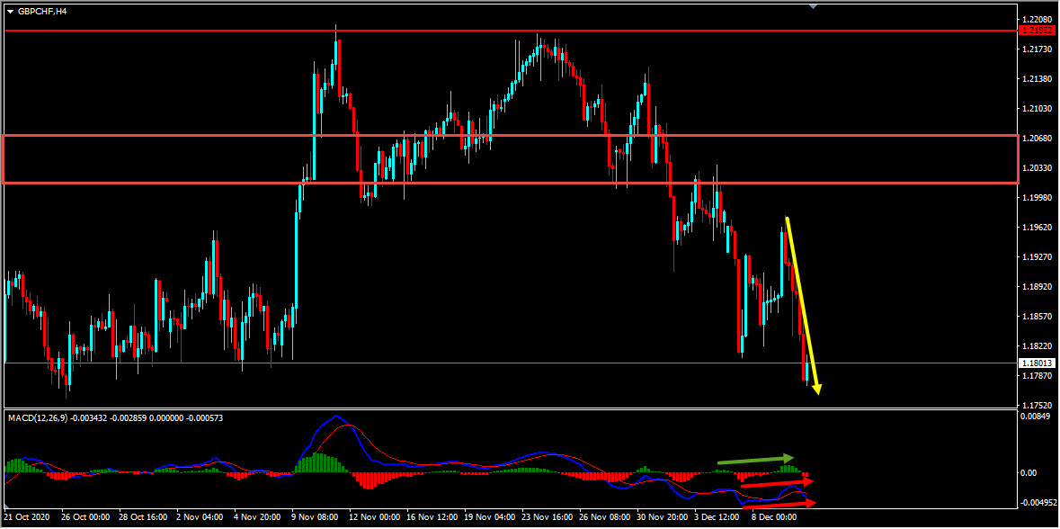
“On the H4 chart we could see that the price which is moving lower has created a bearish trend pattern in the form of three lower highs, lower lows we may consider this as evidence of bearish pressure. Generally, after a bearish trend pattern, we may expect corrections and then further continuation lower. Currently, it looks like the correction that we are looking for is happening. Based on the Parabolic Sar we could see that the dots are above the price here as well which we may consider as another evidence of bearish pressure. Also the ADX indicator gave a bearish signal at the cross of -DI (red line) versus +DI (green line) and the main signal line (silver line) reads value over 25. We may consider this as yet another evidence of bearish pressure. So based on all this my view remains bearish here and until the strong resistance zone shown in the screenshot below holds I expect the price to continue lower further”.
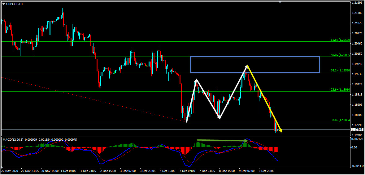
On the H4 chart after the bearish trend pattern I was expecting the price to continue lower further until the strong resistance zone holds. The price action followed my analysis exactly as I expected it to and moved lower further delivering around 200 pips move so far.
Note: If you want to learn about Money Management you can find it here
So, traders, this is why I wanted to show this example to help you understand how important it is to follow the facts. The facts were supporting the bearish view here and there were no signs against it. When the facts do happen as we expected you can see how the price perfectly moved as per the plan. Because these are the kind of hints the market provides us at majority of the times and it’s our obligation as traders to be able to listen to these things that the market tells us and we should try to make the right actions.
(Note: You can follow us here on Trading View and also on our blog to get similar ideas on a daily basis)
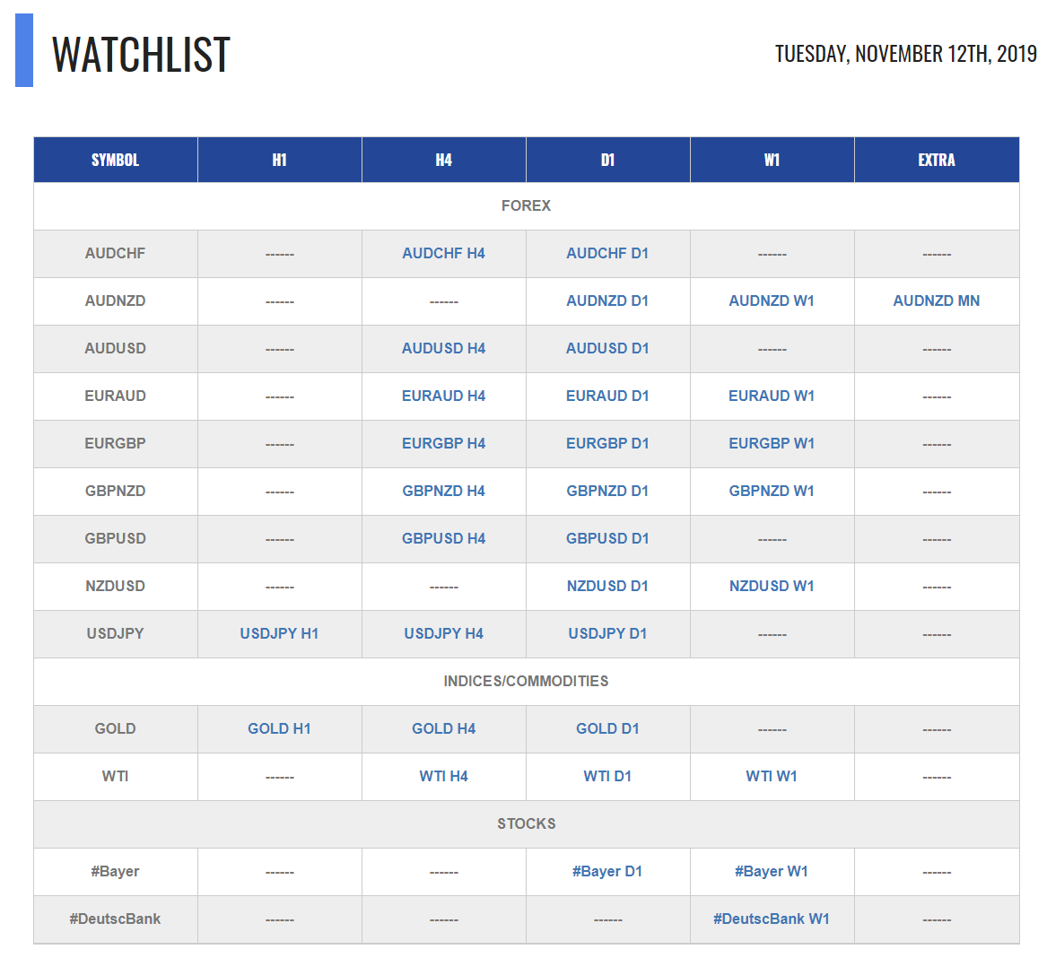
For similar trade ideas and much more join the Traders Academy Club and get access to our complete watch list and trade report.
This is how the report looks like. A table with the hottest market opportunities, screenshot behind every pair and time frame (anything that is in blue inside the table is clickable and leads to a screenshot) + a summary in text format, kind of highlights. And of course Live Market Analysis every single day.
If you have any further questions, don’t hesitate to drop a comment below!
Happy Trading!
Yordan Kuzmanov
Chief Trader at the Traders Academy Club
Hi Traders! USDCHF short term forecast update and follow up is here. On May 20th,…
Hi Traders! CADCHF short term forecast and technical analysis is here. We do our analysis…
The dollar was broadly steady on Monday as cautious investors watched out for signals on…
Hi Traders! Arvinth here from the Home Trader Club team. The weekly summary and, review of July…
European markets edged lower on Thursday following more overnight volatility in Asia’s tech-dominated indexes, while…
Hi Traders! EURGBP short term forecast and technical analysis is here. We do our analysis…