
Introduction To Heikin Ashi Candles
Heikin Ashi Candlesticks are an offshoot from Japanese candlesticks. Heikin-Ashi Candlesticks use the open-close data from the prior period and the open-high-low-close data from the current period to create a combo candlestick.
The resulting candlestick filters out some noise in an effort to better capture the trend. In Japanese, Heikin means “average” and “ashi” means “pace” (EUDict.com). Taken together, Heikin-Ashi represents the average-pace of prices.
Heikin-Ashi Candlesticks are not used like normal candlesticks. Dozens of bullish or bearish reversal patterns consisting of 1-3 candlesticks are not to be found. Instead, these candlesticks can be used to identify trending periods, potential reversal points and classic technical analysis patterns. A fantastic in-depth explanation on the subject provided by Dale Woods (Original article could be found here) explains all you need to know.
Have you ever been riding a trend, then been spooked out of a position because it seemed like price was going to turn against you – only to see the trend continue another 300 pips?
Maybe you’re having trouble spotting the main trend, or market reversals?
Heikin Ashi candlesticks may be of interest to you, they can help with: trend analysis, pinpointing key reversals, and enhancing your exit strategy.
Heikin Ashi candlesticks are another clever invention from the minds of great Japanese traders. I’ve been a fan of these modified candlesticks for most of my trading career, but I feel they are rarely spoken about or used to their full potential.
They are a lesser known customized form of price action – but building in popularity, providing traders a new insight into technical analysis.
These bad boys can be used with any market on any time frame.
In this guide, I am going to walk you through how Heikin Ashi charts work, and how these customized candlesticks can give you a different unique perspective and perhaps change the way perform your chart analysis…
THE ANATOMY OF A HEIKIN ASHI CANDLE
 Translated from Japanese, Heikin Ashi means ‘average bar’ and you will see why.
They are the result of applying some average math directly to the candlestick structure.
One main goal of Heikin Ashi candlesticks is to eliminate noise on the chart. This is achieved through the way the Heikin Ashi charts are built through the equation.
The ‘formula’ for their construction is designed to creates a ‘smoothing’ effect – filtering out the irrelevant moves, while maintaining the display of the dominant price action.
Heikin Ashi candlesticks requires data from the previous HA candle, meaning they essentially build off one another. It is this chaining effect that gives a really unique view into the market.
The classic candlestick we’re all used to has a high, low, open, and close price. These figures are taken directly from the raw price action.
Heikin Ashi candles have the same 4 data points, but they each have some unique math behind them – which is important to understand if you’re going to use them.
- High Price = highest price out of the current candle’s high, open, or close price
- Low Price = lowest price out of the current candles’s low, open, or close price
- Close Price = (open + high + low + close) / 4
- Open price = previous candle (open + close) / 2
To summarize, the high and low prices are nothing special. The Heikin Ashi candle will just show the highest and lowest data point achieved while it was active.
What you will find in strong bullish conditions is that the open and low price are the same, and during bearish momentum, the open and high price are equal.
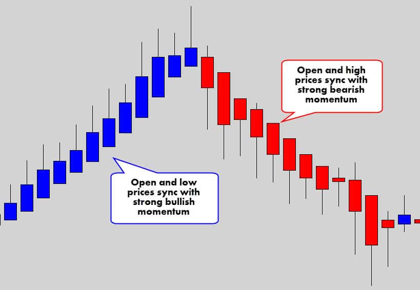
When the open price syncs up with the high or low, you know you you’ve got some good market momentum.
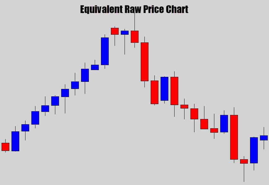
You can see, when you compare the two charts together, how the Heikin Ashi chart helps filter out those counter trend movements and keep the dominant trend in display.
It’s the way open and close prices are calculated that gives this filtering effect.
The open price is derived from the previous candle’s open and close prices.
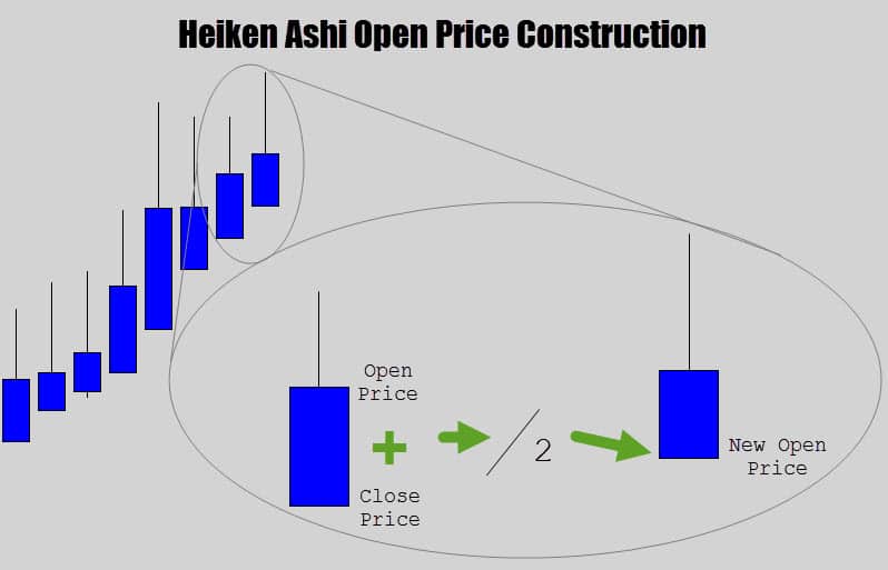
If you look at the formula carefully, it makes each new Heikin Ashi candle open in the middle of the previous candle’s body’s range.
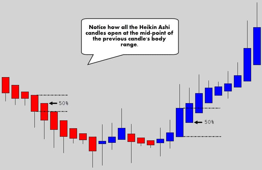
One of the main reasons these charts looks so neat and orderly is the way the open price is being printed.
The close price is the other interesting aspect of the Heikin Ashi candlestick anatomy.
It takes all 4 data points of the candle, adds them together – then divides that figure by four to spit out an average price of all the candle data points.
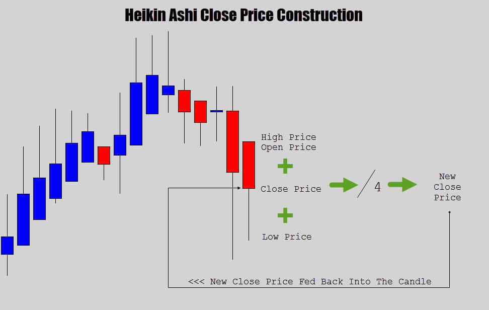
The close price is basically the average point of all the prices in the candle.
It’s important to understand that the close price also means the current candle price while the candle is active. When the candle closes, the last close price will be cemented in as the final close price.
Every time the market receives a new price tick, the Heikin Ashi formula is executed again, all the prices are recalculated and the candle anatomy is updated appropriately.
SUMMARY
Heikin Ashi are a unique kind of ‘average’ candlestick which build off one another to created a smoothing effect. This gives a new perspective of the price action, opening up the door for some unique technical analysis.
BENEFITS OF HEIKIN ASHI CHARTS
There are many benefits a Heikin Ashi chart can provide to your technical analysis.
Obviously, the main purpose of these charts is to clean up the noise and display dominant trend strength.
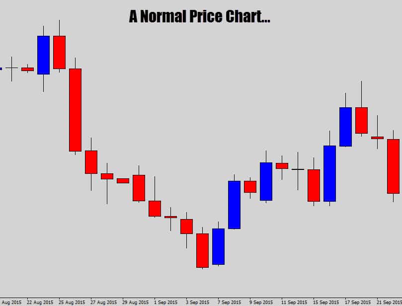
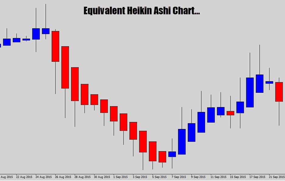
Notice how the Heikin Ashi charts prints out a lot smoother price action, helping draw out the main market movement.
Check out what happens during strong trending markets.
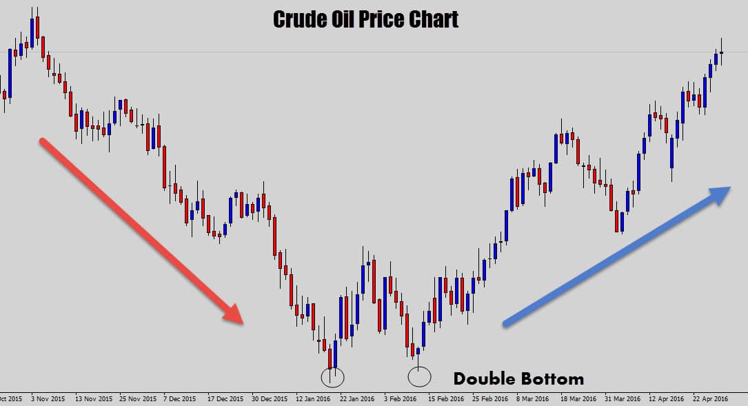
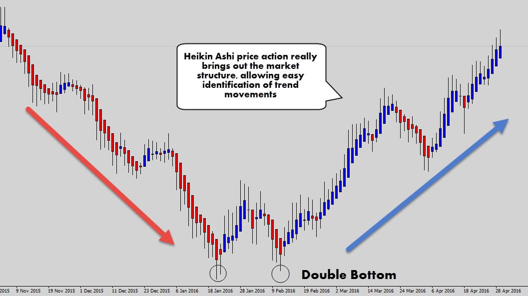
Although the price chart is fairly easy to read, you can’t deny that the Heikin Ashi chart does a very good job at straightening out the market structure.
We can easily see where the core trend movement is and where the counter trend corrections are occurring.
Even the double bottom pattern looks a lot cleaner.
If you’re having trouble determining the trend, these charts could be a good aid for you.
They are also great for keeping you in a trend trade longer. It is common to believe price is moving against you, and find out you got spooked out by a counter trend retracement soon after.
I know there are a lot of traders who ‘cut their profits short’ in these scenarios.
Check out how Heikin Ashi charts may help with the psychological problem of ‘price moving against you’…
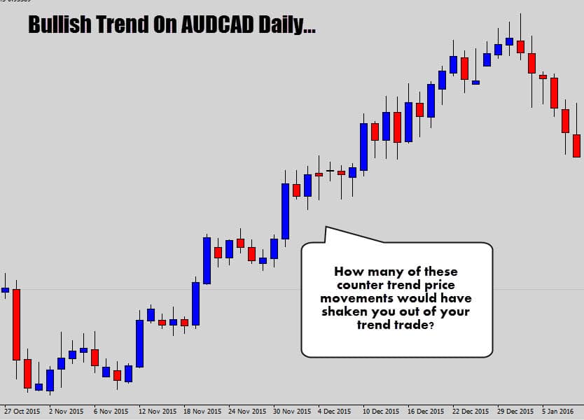
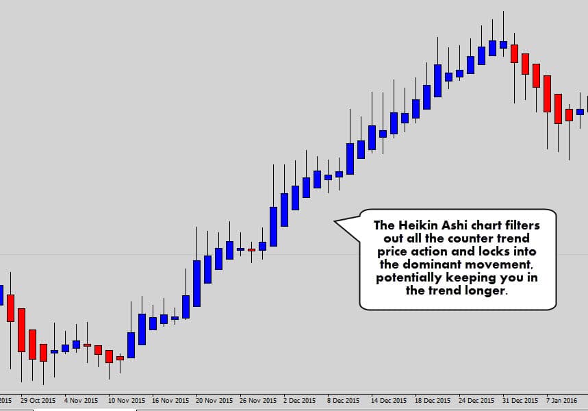
This is one of the key advantages of HA candlesticks, the ability to ‘cut the crap’ when the market is trending.
Look how well of a job they did in the AUDCAD example above. You basically only see blue candles until the trend dies out, and then a larger red candle is printed.
Charts like these maybe just the thing you need to stop those early exits.
Reversals can be much easier to spot, especially with the classic ‘color change’ in the Heikin Ashi candles…
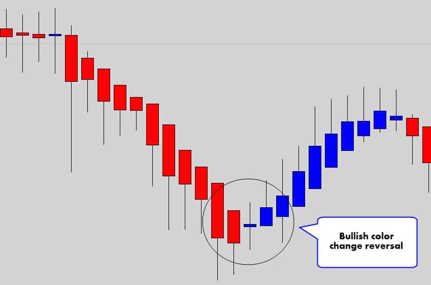
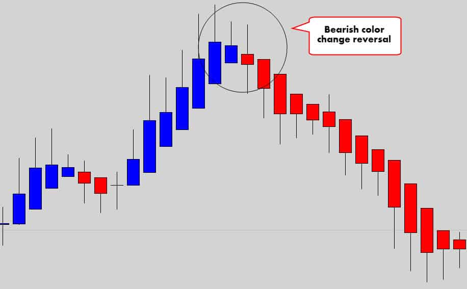
You can see that when the candles change dramatically from bullish to bearish, there can be a large follow through reversal.
Obviously it wouldn’t be profitable to trade every single color change because when the market falls into consolidation, you will get eaten alive.
These reversals tend to be more potent after a large bullish or bearish move has already occurred before leading into the color change signal.
SUMMARY
The filtering effect of Heikin Ashi candlesticks allows for a very clear view of the market structure and dominant trend movement. This allows traders to spot trends easily, ride them out longer to their full potential, and also spot reversal opportunities when they die out.
HOW TO READ HEIKIN ASHI CANDLESTICKS
So far, we looked at how the HA candlesticks can help provides a better visual experience for traders, and collectively help with market analysis.
Now lets dive into the individual Heikin Ashi candlesticks and learn how to read the individually.
- If the body of the candle is bullish – it reflects a bullish environment.
- If the body of the candle is bearish – it reflects a bearish environment.
- If the body of the candle is thin, and there is wicks protruding out both ends of the body, the market is indecisive, has stalled, or is consolidating.
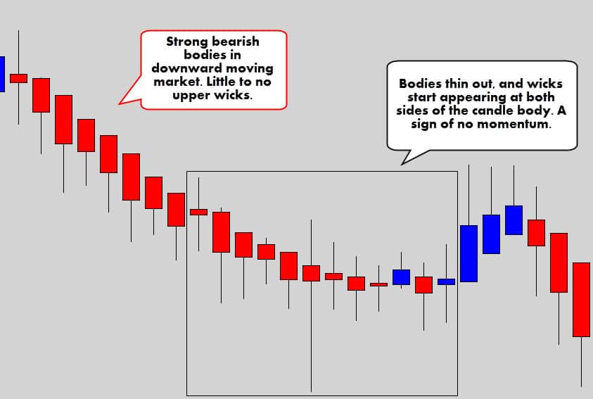
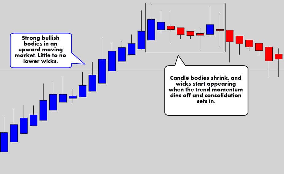
If a strong trend is underway, the candlesticks become a gauge to the current trend strength.
Remember the close price is the average of all the data points in the candle, so if the close price is very high, then you have strong bullish pressure in the market.
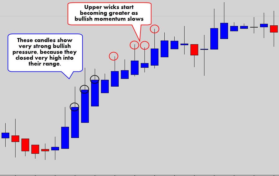
Upper wicks will start to appear when the bullish momentum slows down, and more bearish pressure starts to enter the market.
Same obviously applies to bearish conditions. The candles will close lower into the candle range under strong bearish trends.
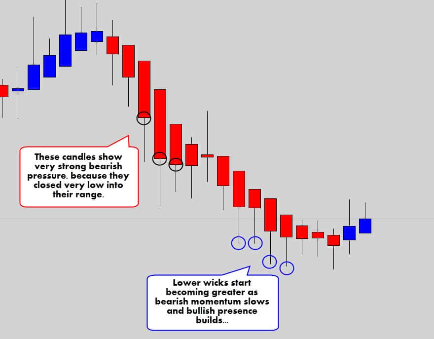
Remember:
- Big candle range + big candle body = Strong momentum
- Small candle ranges + small candle body = Weak momentum
Because these candlesticks change drastically when the market conditions shift, it’s very easy to see when the markets fall into consolidation, when you don’t really want to be in the market.
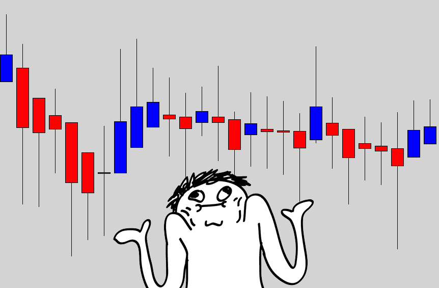
It’s fairly easy to spot dangerous market conditions with Heikin Ashi price action.
Try to stay out of the market when you start seeing doji like candles, especially large ones.
When these charts go into nasty sideways action, there will be a lot of candles with wicks coming out of both ends of the body – a warning sign to be on the side lines.
I always say, if you can’t make sense of the chart, then simply don’t trade it!
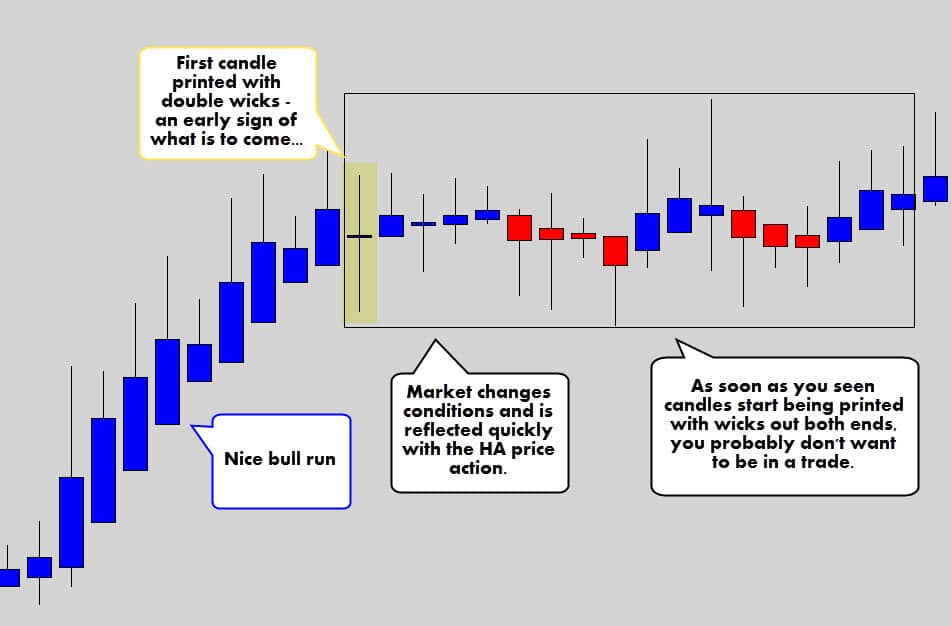
The chart above shows how these charts can do a great job and displaying a the change in market conditions.
One Doji formation – a double wicked candle – was a warning sign of dangerous consolidation to come.
Like normal candlestick chart, Doji patterns are a reflection of indecision, consolidation or unstable volatility. The effects of Doji candles on HA charts are more emphasized.
SUMMARY
The HA candles change dramatically in appearance when price conditions change – making them an aesthetically easier chart to understand. Big body candles generally mean good trending strength, small double wicked candles generally mean bad trading conditions.
WARNING: HEIKIN ASHI CANDLES CAN BE VISUALLY MISDIRECTING
When you look at these charts, you will imminently think it is a gold mine. But we all know there is no free lunch ?
If you remember the calculations we went through before on how a Heikin Ashi is formed… you might have picked up that Heikin Ashi candlesticks don’t always reflect the current prices in the market.
In a normal candlestick, the close price is the current price in the market.
On a Heikin Ashi candlestick, the close price is an average of all the candle data. This means the close price of a Heikin Ashi candle is going to be different to the current market price!
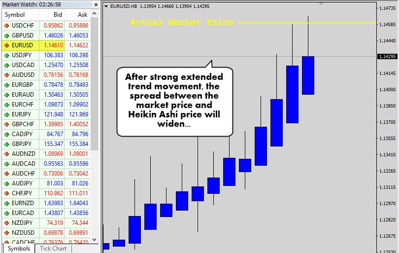
As a trend develops, the Heikin Ashi candles really start to build momentum off one another as price is driven higher or lower – the spread between the actual market price and the HA price will expand dramatically.
I actually like this mathematical outcome because it punishes traders for buying too high and selling too low – which is a common problem for novice trend traders.
When the market settles down, the distance between real price and HA price will contract significantly.
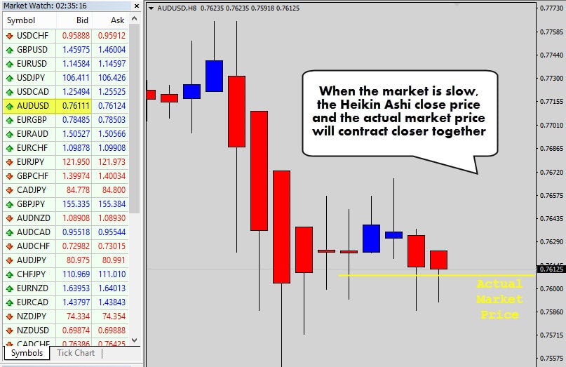
Notice how the prices are fairly aligned in the chart above. The trending conditions have stopped and the market is drifting sideways, allowing the market price to catch up with HA price.
Now when a trading opportunity occurs, you will be able to get in closer to the market bid.
Just remember, when you’re taking a Heikin Ashi trade, to check where the real market price is. This is important because you need the real market price to execute correct risk management calculations.
SUMMARY
Heikin Ashi charts can be misleading when compared to the actual price of the market due to the average math in the construction of these candles. The spread between HA price and real market price widens after strong momentum and contracts when the market stalls. This discourages buying the tops, and selling the bottoms.
HOW TO TRADE HEIKIN ASHI – SOME TRADE IDEAS
Allow me to give you some ‘food for thought’ to get started with trading Heikin Ashi charts.
Traditional forms of technical analysis, and your classic chart patterns are still going to be relevant.
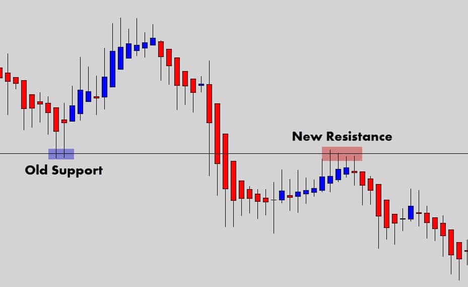
We can see above the classic swing level still being relevant. Look how well HA displays the ebb and flow off support and resistance levels.
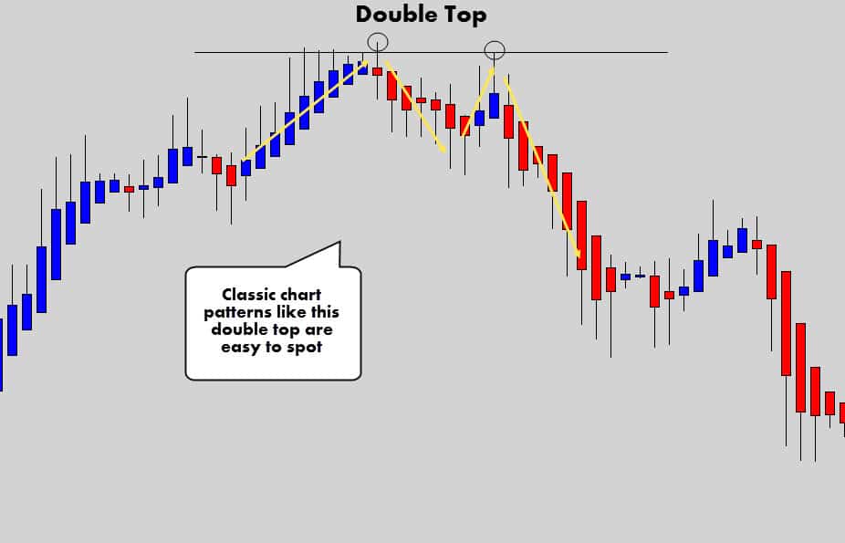
Classic patterns like the double top, and the head & shoulders patterns can be easily spotted and traded as per your plan.
Consolidation breakouts are also easy to spot and work out well.
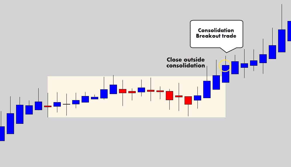
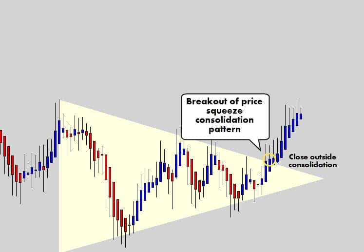
Whenever a Heikin Ashi candle closes outside of these consolidation structures, it is a good indicator that a breakout is underway.
It may even be beneficial to watch lower swing trade time frames to catch an intra-day HA breakout for an earlier entry – because you’ve always got to keep in mind the spread between the HA price and the real market price.
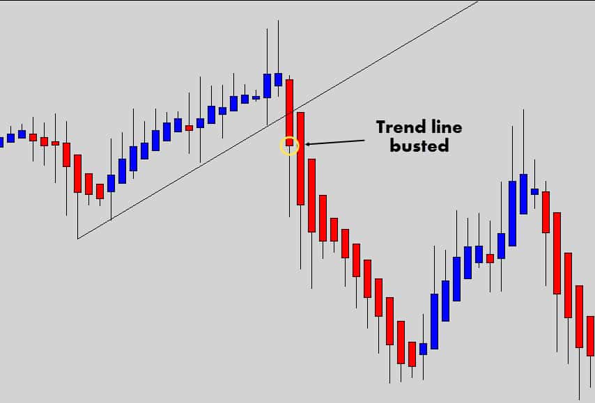
Another example of effective structure breakouts are simple trend line breaks.
Due to the market structure being easy to see with Heikin Ashi charts, trend lines are easier to mark. Watch for the break of obvious trend lines…
These charts are also an excellent opportunity for trailing stops… especially during strong trends.
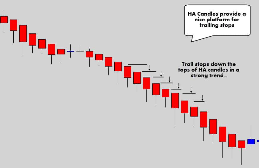
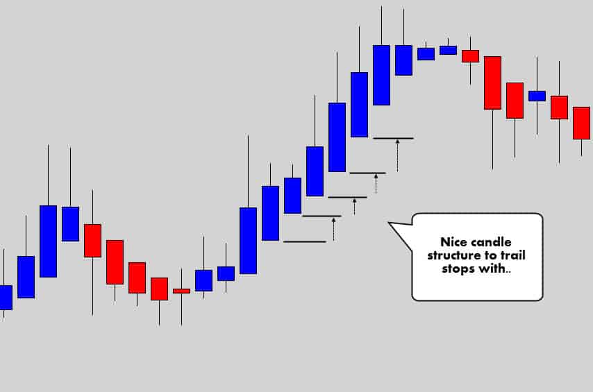
When the open price aligns with the high or low of the candle in a trend, this may the opportunity for you to trail your stop if you’re into that.
Trailing a stop behind the previous candle’s low or high may be a little aggressive – consider trailing the stop behind the high or low of two candles ago.
The stacking trend candles may also be used with scale in strategy, adding to your position as the trend develops.
Careful with this though – because the HA / Market price spread is going to increase as the trend develops, making it more difficult to scale in as the trend extends out.
SUMMARY
Heikin Ashi charts really open up the door for some unique strategies, while still maintaining use of classic technical analysis. Market structure and consolidation periods are simpler to spot. Therefore, breakout trades are more obvious. The structure of HA candles also open up the door for some clever money management strategies.
Source: www.theforexguy.com




forexguy is the original author of this article pfff
stupid
Somebody, before you call someone or something stupid, take a moment and look at the mirror
That’s exactly what is said on the bottom of the article as source –
https://www.screencast.com/t/eaYdrymz
Always with a pleasure Mike
Hi Mike
Yes you will miss some of the moves, not always though, it still eliminates a noise many times
About other indicators, from my view, not really required
Thanks Vladimir I appreciate the response and information.
As a follow up, is there a second confirmation indicator (like a stochastic?) that could be used to permit you to enter the trend with more accuracy? Are there any of these secondary indicators that you have found to be particularly useful in conjunction with HA? Thx.
Vladimir:
This is very useful – thank you. My question pertains to the spread between the market price and the HA price. How do you use HA for entry/exit during a trend if the HA is always lagging the market price? Surely you are going to always miss the majority of the trend, or am I missing something? Many thanks.
I’m glad it is helpful for you guys! I also find it very descriptive and useful and this time the credits go to the “forexguy” !
Vlad you have changed my trading way and really good
Vlad is amazing! well done job! He is the best mentor 🙂
Really ,good stuff mate!!